The Big Data world we live in creates an increasing need for developing and reinventing the medium of data visualization. The medium has evolved into an elaborate language we can use to present facts about the world. However, by striving to be universal and objective, the dataviz medium is struggling to acknowledge the personal and the emotional side of our relationship with data.
Inspired by Giorgia Lupi's Data Humanism, I've started to work with physical data visualization in the context of experience design, often collaborating with prof. Isidora Nikolić.
This particular project was created during a data visualization design workshop at the Designer – Author or Universal Soldier Conference, an international design conference in Belgrade.
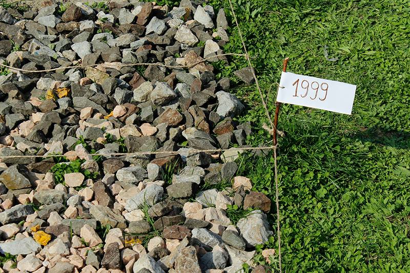
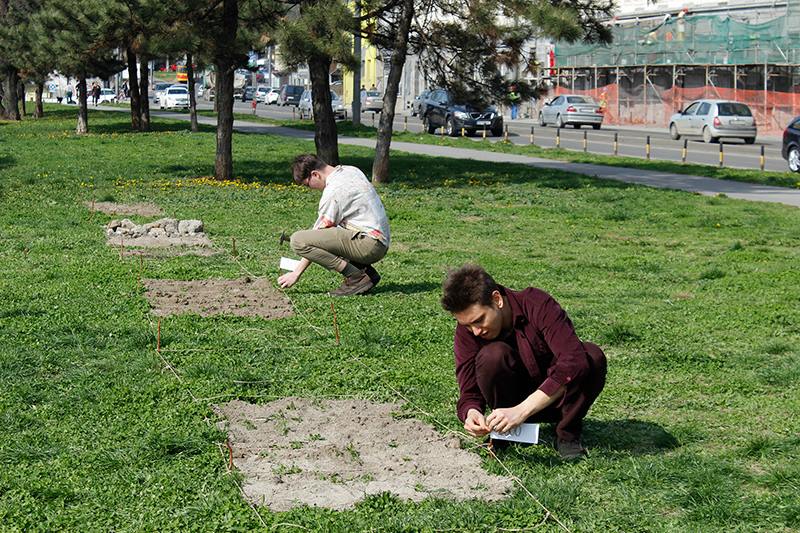
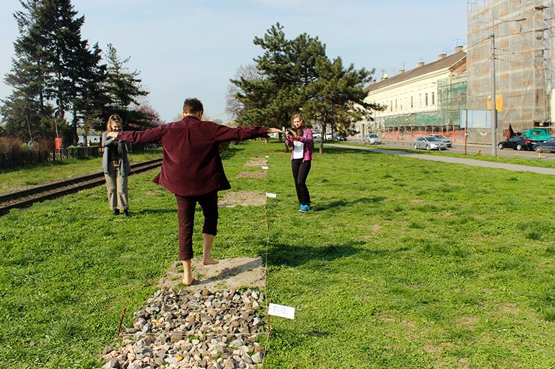
The goal of the workshop was to find the best and the most innovative way of representing a dataset about local air pollution. The database records contained monthly air quality indices for a period of 5 years or 60 months, from 1998. to 2003. After going through a series of ideas, we decided to make a physical piece, something you not only look or listen to but also touch.
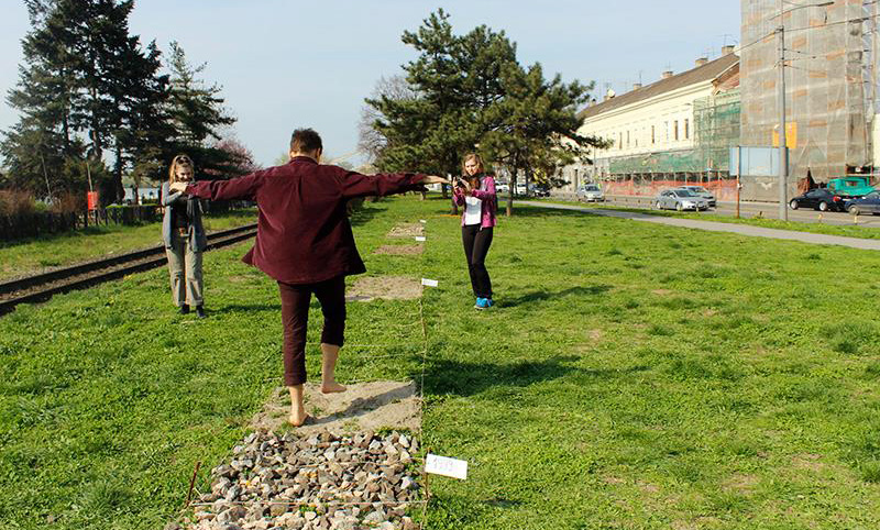
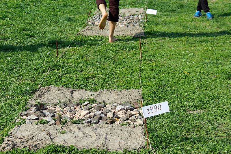
We built a walking path as a physical form of a air pollution data heatmap. 1 meter wide, 30 meters long, the path was divided into 60 segments. Each segment represented a monthly air quality index for the given 5-year period. Grass stood for a month of good quality air, sand is medium, gravel is bad, rocks are terrible.
By walking barefoot, workshop participants and exhibition visitors could feel the long-term change of air quality during the period of 5 years.
One of the workshop participants Ivana Miljković created a video about this project.
Examples of this kind of dataviz approach include projects such as Physical Dataviz Workshops and the Trees of Petnica. ■